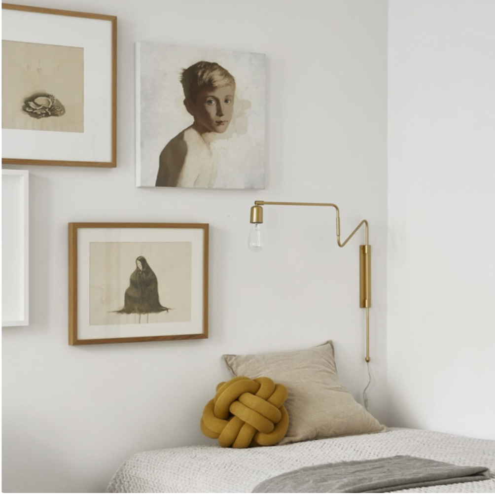
How to create a dream gallery wall?
At another time, I created the sets for the different rooms of a renowned furniture store. I chose the bedding, the color of the walls, the accessories and the furniture. Picture frames, I've hung hundreds and hundreds of them in my life. And for some time, I see on several of my favorite Instagram accounts beautiful "Gallery wall".
It also makes me want to do it again! But since I don't have big walls at home and I no longer work in a store, I thought I would satisfy this creative impulse that spring brings back to life… by giving you my best tips and my inspirations!
Making a "Gallery wall" worthy of a magazine is a complex art and some will not risk it for lack of insurance, but with these little tricks there is no reason to be afraid.
Choose items to hang
As it is eclectic, we can put everything that speaks to us or that touches our heart: painting, illustration, photos, portrait, vintage frame of different sizes. What I like is to mix in a distinctive object: it can be a mirror, a clock or a beautiful wall candle holder. This addition helps break up the rigid rhythm of rectangular shapes.
Tip for a harmonious result
You can put whatever you want, but there are rules to follow to create visual harmony. The trick is to create links by choosing similar colors, materials or textures. For example, here, it seems heterogeneous, but the gold is found in two of the frames, then the black of some paintings is also found in the frames of others and the silver of the mirror in the left frame. Nothing is left to chance!!!

How to proceed
Start by cutting out the shapes of your frames and objects from kraft paper, newspaper or cardboard. Then, lay them out on the floor to do some tests by choosing a centerpiece (often the largest) and embroidering around it. For example, here the centerpiece is the frame with trees. In the visual sequence, we first look at her. The eye will continue to read the whole afterwards. This piece is therefore given a central location.
FREQUENTLY ASKED QUESTIONS
How high should I position my frames?
The middle of your frame or your composition must reach your eye level, approximately 5'.
What should I hang my frames with?
I have hung over 1000 frames in my life and only one has fallen off.. oops, yes, but that was because I had hung so many frames often in the same place that there was nothing solid left !
But what I mean is that it is not necessary to put butterfly screws or dowels that make holes as big as dollars. A simple frame hook is enough or a good old nail driven at 45 degrees if the frame is small.
And if your boyfriend freaks out because you're going to MAKE HOLES IN THE WALL, there's always that.
How to process a set of frames?
In the end, it must form an entity as if it became a single frame. Generally, the space between each piece should be a maximum of 2 to 3''.
There may be gaps, I advise to leave only one at most 2 and the gap should not exceed 10''.
COMPOSITIONS
Option 1:
For composition, some like to fill the walls. Personally, my philosophy is as usual: less is more. That is to say that if you fill your wall completely, you will inevitably miss a few frames in passing in your reading. The eye will no longer know what to look at and will be led to look elsewhere. So, even if you like 25 frames, go for it by elimination to keep only the best choices and above all don't hesitate to choose larger works than several small ones. Believe me the result will speak for itself!
So we start from a centerpiece and we do a round (or rectangle) reading to come back to the centerpiece.
Here are examples of composition that are in my opinion the most successful....
(Because, yes, I also studied art history and believe me, composition is the key to the greatest masterpieces 👩🏻🎨 Nothing is left to chance! )


Option 2:
If you want to do a complete wall, you have to treat it as a complete work; as if it were a large painting. It doesn't have to be straight, but you will have to draw an imaginary rectangle on your wall in which you will work. Then, the chosen pieces should be aesthetically similar in terms of colors, materials and finishes.


With these tricks, you can't go wrong, but if you like to dare, know that the rules are also made to be broken!
INSPIRATION: My current favorites

INSPIRATION
My current favorite accounts

