International Delivery - FREE SHIPPING IN CANADA on all purchases of $250 and more
Skip to content

Unlocking the Secrets of Frame Arrangement: Expert Advice

3 EASY-TO-APPLY PRINCIPLES

Since the start of the year, we have heard a lot about a new trend in decoration: personalization. And this will be, according to many experts, a major trend in the coming years.

So, no more white, impersonal and standardized decors. We now want decorations that have a soul. Decors that tell a story.

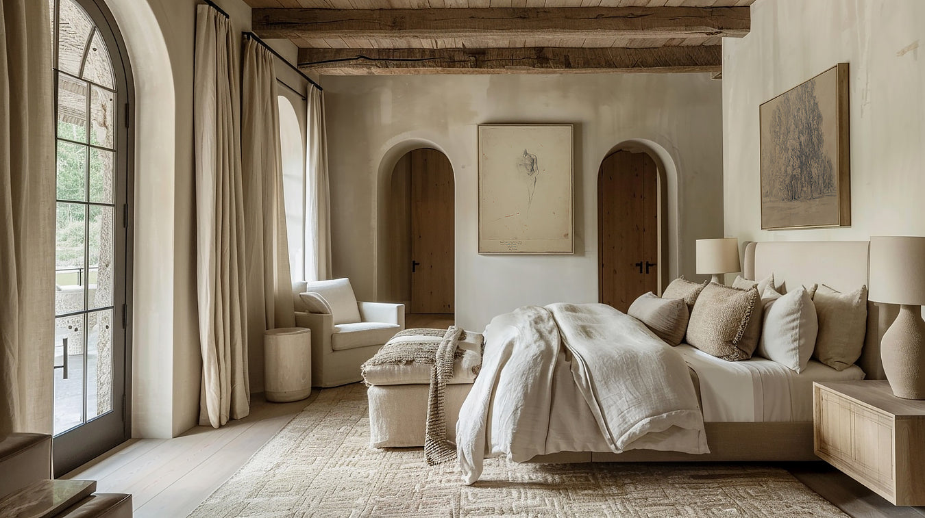
And I admit that I have always been very fond of this type of interior. In my opinion, this is what makes a decor beautiful. When it has depth. History. And a lot of visual impact.

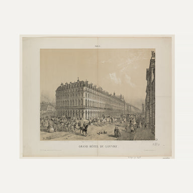
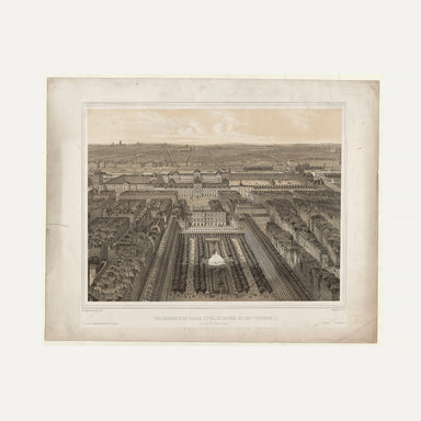
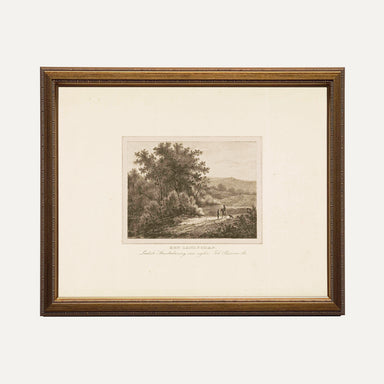
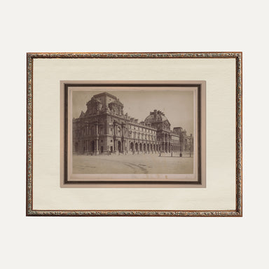
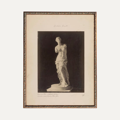
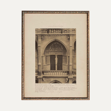
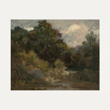
This is also why I have always loved vintage. It makes it easy to add history to a space and a lot of narrative richness.

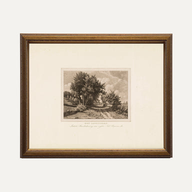
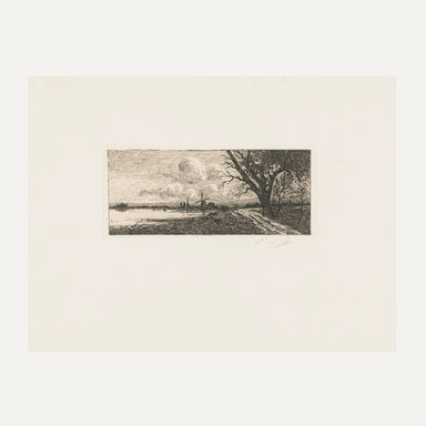
And this is also why I particularly love paintings and frames.

There's no better way to easily and inexpensively personalize a space and inject personality.


But as with everything in decoration, there are designer tips to really highlight your artworks and arrange them skillfully on the walls.

And what seperates a designer decor from an ordinary decor is avoiding at all costs the overly "matchy, matchy" style.

Fortunately, I am here to reveal to you some of the best designer secrets so that you succeed in your project every time.

Creating a harmonious composition: 3 key principles

In decoration, just as in art, knowing how to apply the principles of composition is essential.

This is what will naturally attract the eye. Harmony and beauty are the result of balance and art must express this.

Whether it's repetition, balance and contrast, playing with one or more of these principles is the secret to moving from a regular decor to one that takes your breath away.

In fact, artistic principles can be seen as "equations" that lead to beauty. Just like math, art requires a certain amount of structure and organization. In both cases, there are rules, forms and principles to follow to achieve a coherent and meaningful result.

Let's explore them in more detail...

Designer tip:

Rhythm & Repetition

In the case of a set of frames on the same wall, we must think of the composition as if we were composing A GLOBAL WORK.

In this particular case, use the repetition of patterns, shapes, colors, or medium (photo, painting, sketch, etc.) to create a visual link in your composition.

This can help make elements come together and create a sense of cohesion.

Rhythm and Repetition:

Rhythm and repetition can help unify elements and create a sense of cohesion. But most importantly, by also alternating repeated elements with subtle variations, you can maintain the viewer's visual interest. To do this, use the repetition of patterns, shapes or colors as a link between the different frames to create a visual rhythm in your composition.

Here's how you can apply it:

-Choose a recurring pattern or theme: Select a common pattern, color, or theme that you want to repeat across your frames. This could be a specific color, an art style, or even a particular subject (like travel photos).

- Vary elements while maintaining consistency : Use a variety of frames, sizes and shapes while maintaining consistency of the chosen pattern or theme. For example, you can have a combination of black and white frames of different sizes, but all with landscape photos.

- Create visual rhythm with repetition : Arrange frames to create a flowing visual rhythm throughout the piece. Alternate frames in a balanced way to create a rhythmic repetition effect. You can use simple rules, like uniform spacing between each frame, or play with varying gaps to create a more dynamic rhythm.

- Use repeating layout patterns : Experiment with repeating layout patterns to create rhythm in your frame arrangement. For example, you can create a grid or diagonal line with frames for a repetitive, rhythmic effect.

- Create focal points with subtle variations : Incorporate subtle variations into your arrangement to create interesting focal points. This may include slightly larger or more colorful frames strategically placed to attract attention.

- Balance repetition with unique elements : Also incorporate unique or distinctive elements to prevent repetition from becoming monotonous. This could be a frame of a different size or color, or a piece of art that stands out from the rest of the composition.

Using the principle of rhythm and repetition, you can create an arrangement of frames that is both harmonious and dynamic, adding visual interest to your space while maintaining some thematic coherence.

Designer tip:

Contrast

Mixing two works of art with the same medium or theme in the same room can create a mood that is a bit monotonous or predictable. By introducing contrast, you can create a more interesting dynamic in your space.

Contrast

The principle of contrast is an essential tool for arranging frames in a room in a way that creates an interesting and strong visual impact. By using it, we say goodbye to monotony and hello to surprise and differentiation

Here are some ideas for applying this principle:

-Size Contrast
: Vary frame sizes to create visual contrast. For example, you can mix large frames with small ones to create a dynamic effect on the wall. Try grouping frames of similar sizes together to create contrasting focal points.

- Color contrast : Choose frames in colors that contrast with the walls or other elements in the room. For example, if the walls are painted in neutral tones, opt for brightly colored frames to make them stand out. Or, if you have dark-colored furniture, light-colored frames can create a striking contrast.

- Contrast in shape : Experiment with frames of different shapes to add variety to your arrangement. For example, you can mix rectangular frames with round or oval frames to create an interesting contrast. Also try playing with geometric shapes for a modern and dynamic effect.

- Content contrast : Vary the content of frames to create visual and narrative contrast. You can mix photographs with illustrations, abstract artwork with portraits, or inspirational quotes with graphic designs. This diversity of content creates visual interest and invites viewers to explore each frame individually.

- Layout Contrast : Experiment with the arrangement of frames to create contrast in how they are presented on the wall. For example, alternate between perfectly aligned frames and others slightly offset for an eclectic effect. You can also play with asymmetrical layouts for a modern and dynamic look.

By using contrast creatively, you can create an arrangement of frames that catches the eye and adds personality to your space. Feel free to experiment with different combinations of size, color, shape and layout to find what works best in your room.

Designer tip:

hierarchy & BALANCE

To create a harmonious arrangement of frames, arrange them according to their size and importance, placing the largest and most significant ones in the center or in front, then distributing the smaller frames in a balanced manner around them to maintain a balanced and visually appealing composition.

Hierarchy-BALANCE:

The principle of hierarchy can be very useful for arranging frames in a room to create a visually attractive and balanced composition, but above all to create a coherent whole.

Have you ever felt like there's something wrong with your decor, but you don't know what it is? Most of the time it is a balance problem

Here's how you could apply it:

-Determine the main element: Identify the frame that will be the main element of your composition. It could be a particularly meaningful piece of art, a family photo, or a mirror.

- Place the main element in a central location : Install the main element in a central location on the wall where you want to hang the frames. This can be at eye level, or slightly above if you want to create a feeling of height in the room.

- Organize the frames around the main element : Arrange the other frames around the main element, creating a visual hierarchy. Frames that are related to the main element, for example by theme, color or style, can be placed closer to it to reinforce its importance.

- Use variations in size and shape : Create visual interest by using frames of different sizes and shapes. Larger or bolder frames can be reserved for the most important elements, while smaller frames can be used for secondary elements.

- Maintain a balanced distance between frames : Make sure to maintain a balanced distance between frames to avoid feeling cluttered or messy. You can use simple rules, like keeping a uniform amount of space between each frame, or play with varying gaps to create a dynamic effect.

- Consider alignment and spacing : Make sure frames are aligned with each other to create a cohesive, neat appearance. Also use negative space between frames to contribute to the visual balance of the composition.


Apply the principles: SITUATION

I recently visited a client's home to add the finishing touches after she removed the wall separating her dining room and kitchen. She wanted to hang a few frames and had several favorites, but didn't know how to arrange them together.

And that's one of the problems when people choose decorative items based on their hearts. The heart of course has its place when making decorative choices, but it must be in the service of a precise plan (the mathematical equation).

So, how can we create harmony between these two spaces? In this case, the answer lies in color.

Because it is the first thing that our eye sees and is truly the best way to unify the different elements.


Which is key, especially in an open space. So I started with the olive tones found in the backsplash of her kitchen and the dark brown of the wood of her sideboard in her dining room to create a color scheme for her works.

I placed the painting Portrait of a Child (with dominant tones of green in the painting and brown found in the frame) on the counter (with its olive green background reminiscent of that found in the kitchen) and, on the empty wall The Magnolia , the Tree Sketch , and a few of her artworks that had color tones that met our color palette.

Now, when looking at the space, the repetition of colors and tones creates a coherent and harmonious whole, in keeping with the rest of the room. (the balance)

Additionally, the different sizes help establish a certain hierarchy in the composition.

But the different styles of each element keep everything interesting. (The contrast)

Everything is there and we now have a beautiful space.

One major thing to remember

If all these principles still seem vague, know that the only way to master them is to take action and try.

And if ever you only had one thing to remember start with this, you will be one step ahead of all the settings in the world by applying it.

Tip: Mixing two or more pieces of art with the same medium or theme in the same room can create a somewhat monotonous or predictable ambiance (which is happening in the majority of homes these days). Unless it is part of a set of collaged frames, like a gallery wall or works side by side.

By using contrast intentionally, you can highlight each piece of art while creating a richer, more stimulating visual experience in your space and thus create a unique, refined and cohesive style easily on your own.

And if you missed my article dedicated to the choice of works for each piece, I invite you to consult it here . It will allow you to choose the perfect works to capture the soul of each of your rooms and create a coherent narrative throughout your home. But above all, remember that the advantage of artworks and frames is that they are easy to change. There really is no way to get it wrong. You can easily interchange them according to your desires or the seasons. So, have fun! This will definitely be felt by everyone that enters your home.

MORE PRO TIPS

Acquire all the unique flair of designers, instantly, here.

The ultimate guide to

CHOOSING THE RIGHT FRAME IN THE RIGHT ROOM

The wrong subject in the wrong room can totally ruin everything. And that’s certainly not what we want. We want to be able...

READ MORE

RESEARCH

We have everything you need to create an atmosphere that suits you.